UNA
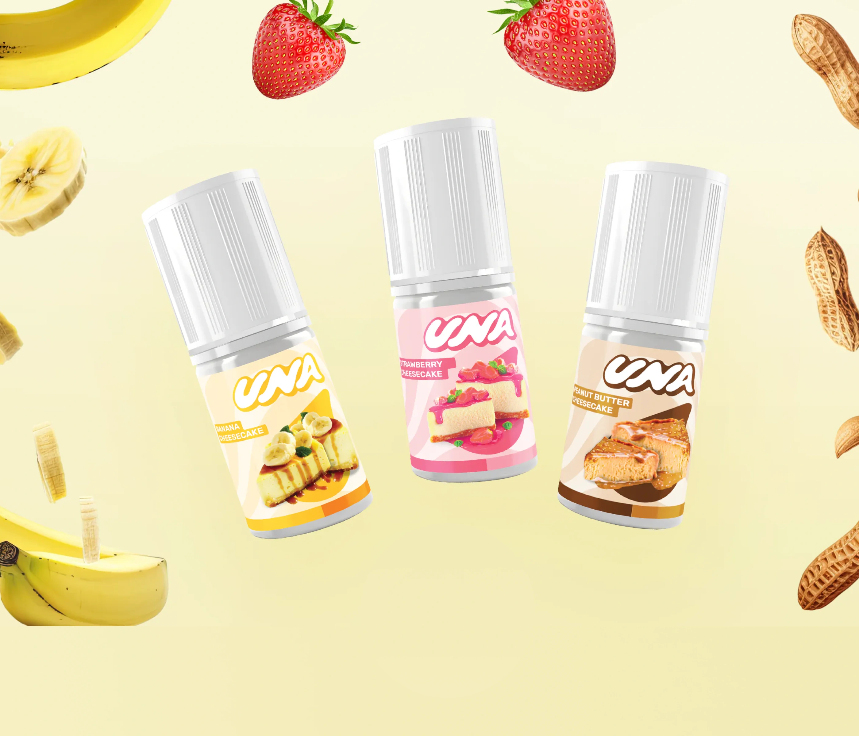
Founded in 2019, UNA first gained recognition through its distinctive cheesecake vape juice flavors. As market preferences shifted and attempts to diversify into creamy and cooling variants failed to gain traction, the brand faced uncertainty. Despite growing brand awareness, UNA hesitated to explore new directions without a clear and enduring brand foundation.
Industry
Consumer goods
Services
Challenge
Rebuilding confidence to evolve beyond early success.
UNA needed to move beyond being defined by a single flavor category. The challenge was to strengthen its brand meaning and identity—so future innovation could happen with confidence, clarity, and relevance across broader market segments.
What We Did
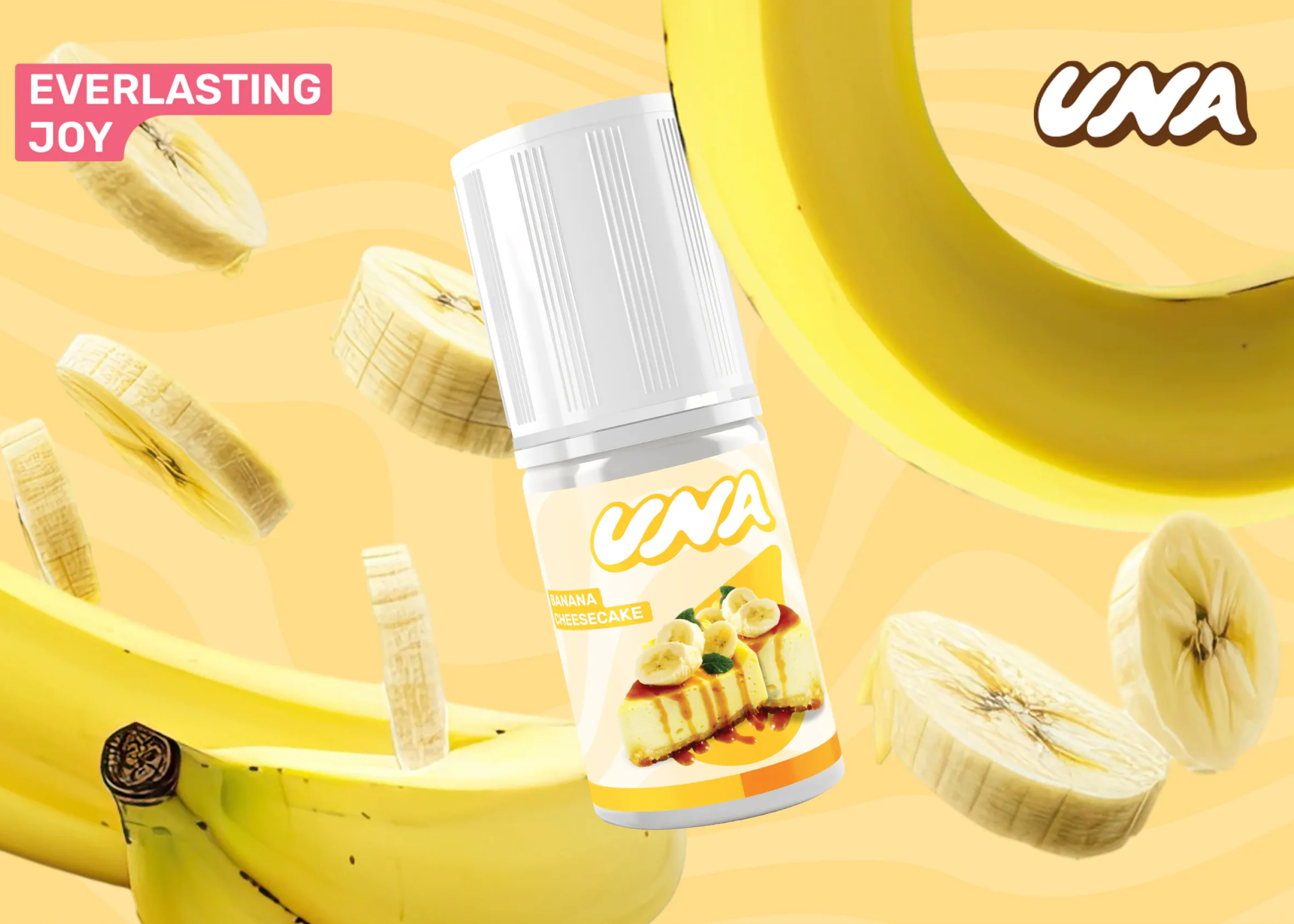
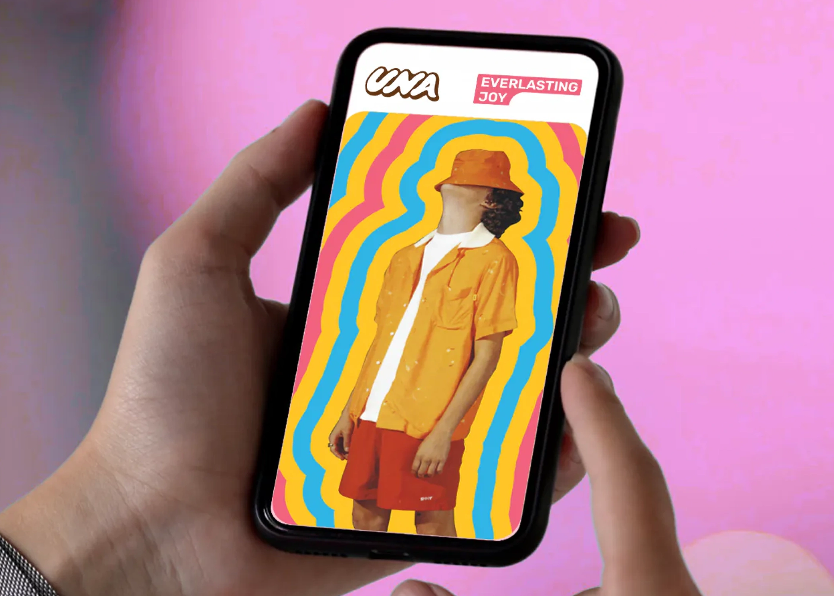
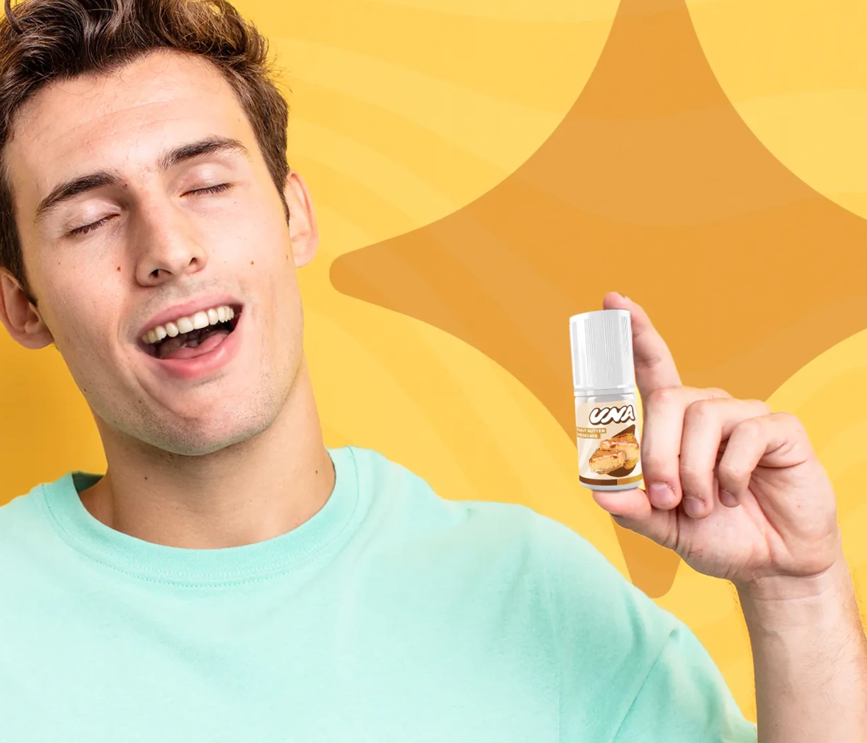
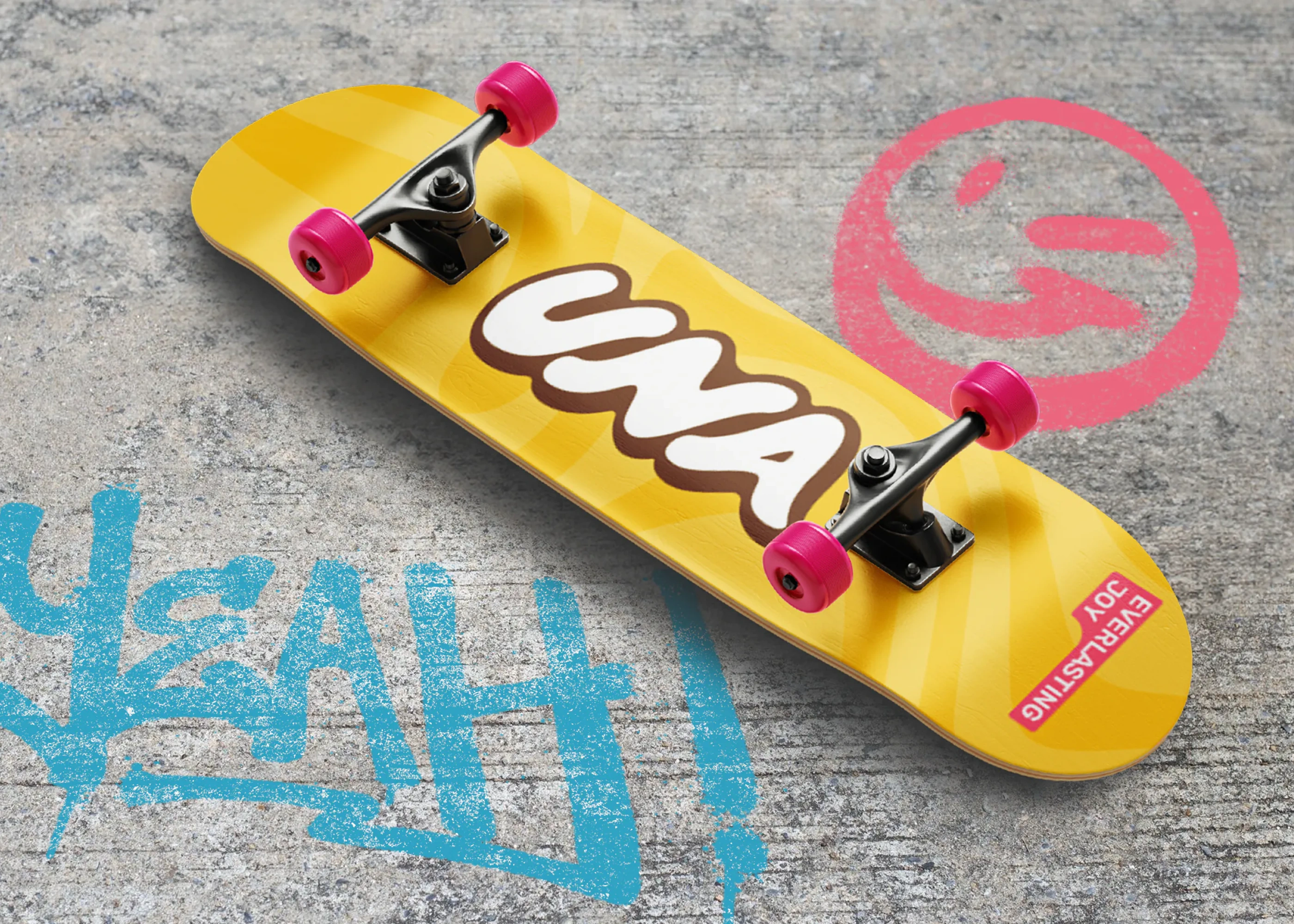
Mahardhika re-established UNA’s brand foundation by reconnecting the brand to its deeper purpose: celebrating joy, pleasure, and positive moments in everyday life. We defined a clearer brand personality—one that feels genuine, lively, and emotionally uplifting—allowing UNA to stand for more than just flavor variants.
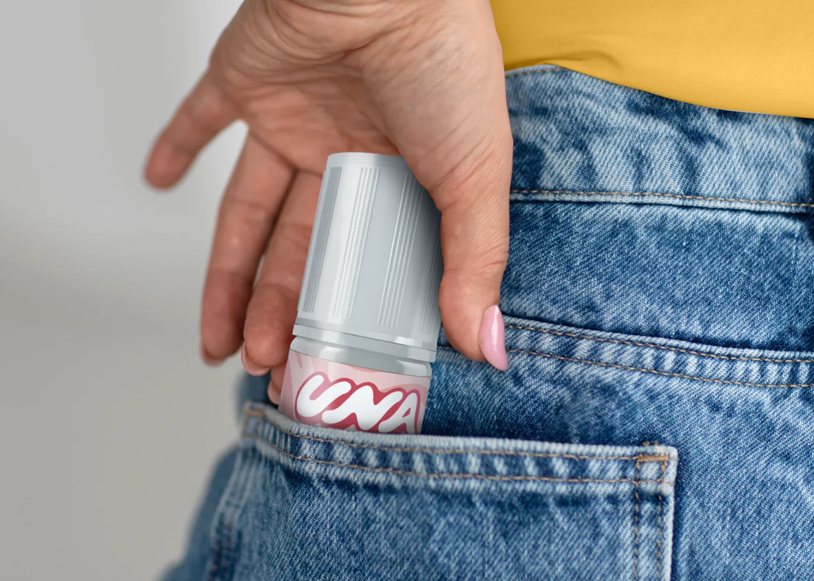
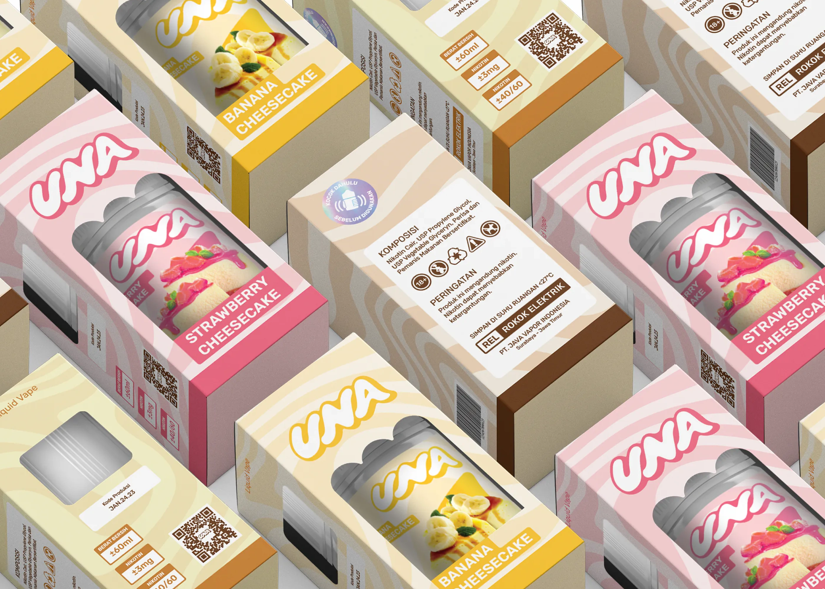
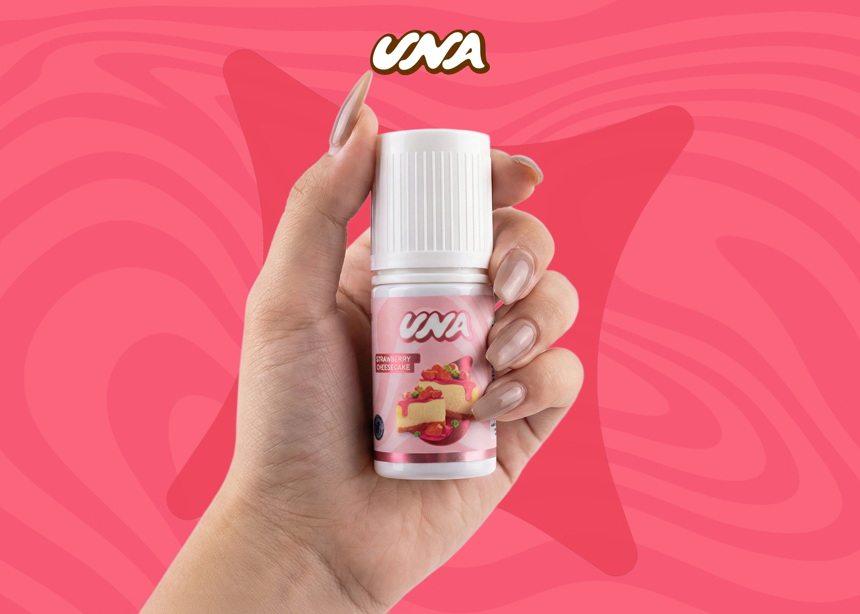
We refreshed the brand identity while preserving the joyful spirit symbolized by the previous logo. The visual system was designed to feel more dynamic and expressive, avoiding monotony while remaining flexible for future extensions. A restrained brown-and-white palette was chosen to ensure adaptability across different formats, flavors, and brand expansions.
Beyond visual identity, we shaped UNA’s verbal world by developing the meaning behind the name itself—UNA as a symbol of happy moments, emotional connection, and simple pleasures. This narrative gave the brand a consistent voice and expressive language that could live across communication, packaging, and storytelling.
Outcome
UNA emerged with renewed clarity, confidence, and emotional relevance. With a stronger brand purpose and a flexible identity system, the brand is now better positioned to explore new flavors and categories without losing its essence. UNA strengthened its presence as a brand associated with joy, pleasure, and meaningful moments—supporting long-term recognition and loyalty across diverse audiences.
Let's build brand clarity with purpose!


