Twitter changes logo to “X”: what does it mean?

Understanding the strategic shift behind one of the world’s most radical rebrands
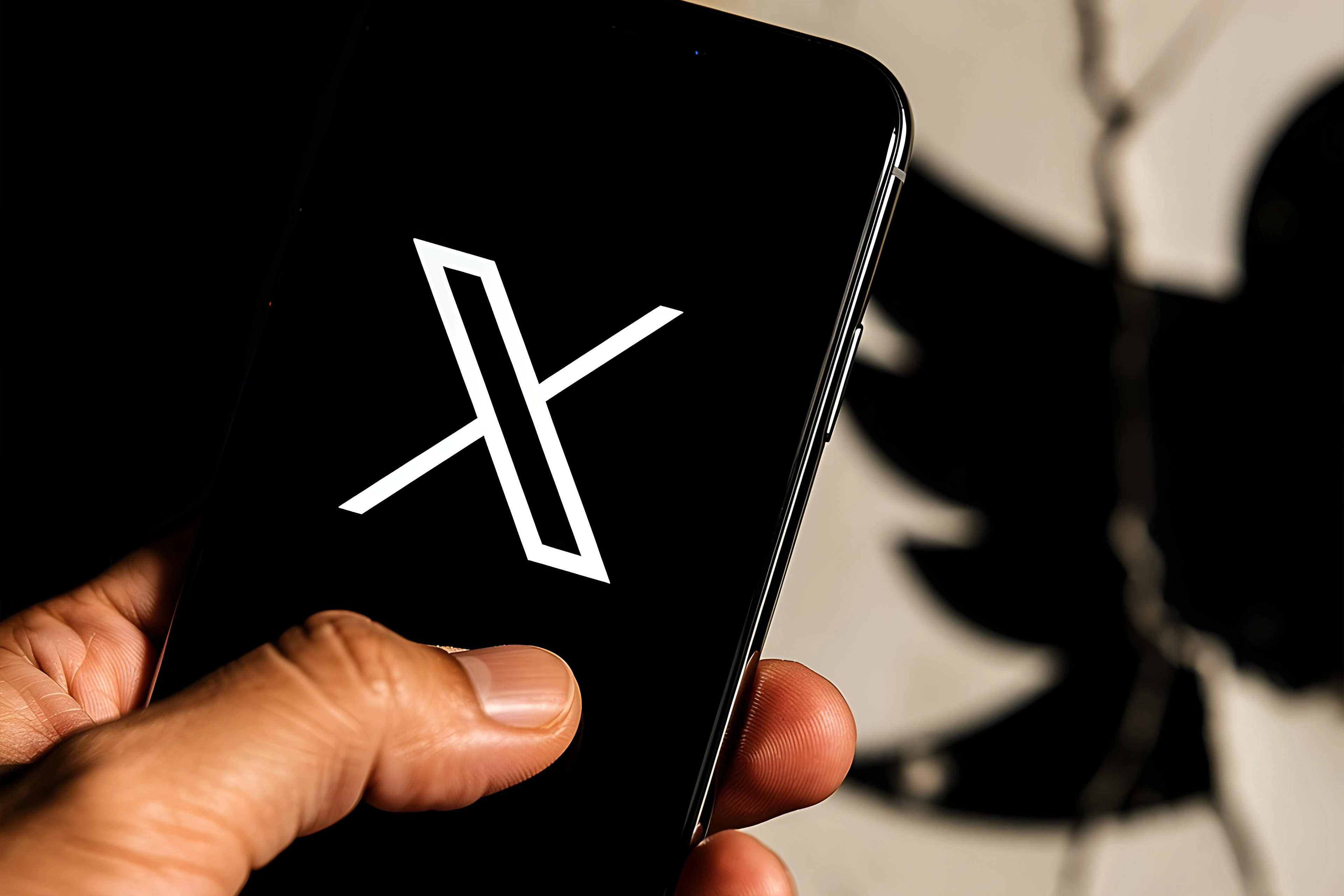
Twitter’s decision to replace its iconic blue bird with a stark “X” instantly captured global attention. For a platform whose identity was deeply embedded in a single visual symbol, this change signaled more than a design update—it marked a fundamental shift in ambition, positioning, and brand meaning.
Rather than focusing solely on aesthetics, the rebrand invites a deeper question: what does this transformation say about the platform’s future direction, and how should brands interpret such a bold move in today’s cultural and technological landscape?
From iconic symbol to strategic reset
Since its launch in 2006, Twitter’s bird logo represented openness, conversation, and real-time connection. Over time, it became one of the most recognizable brand assets in the digital world, strongly associated with news, culture, and public discourse.
Replacing such a powerful symbol is not a cosmetic decision. It reflects a deliberate break from legacy perception and signals a strategic reset. By removing the bird, the brand distances itself from past associations and opens space to redefine what the platform stands for moving forward.
Repositioning beyond social media
The shift to “X” aligns with a broader ambition to evolve beyond a traditional social media platform. Public statements and product direction suggest a vision closer to a multi-functional ecosystem—where communication, content, payments, commerce, and services coexist within one platform.
In this context, “X” functions as a flexible and open-ended symbol. Unlike the bird, which carried a specific meaning, “X” allows the brand to expand without being constrained by previous identity cues. Strategically, this creates room for diversification, experimentation, and future growth.

Minimalism, controversy, and brand risk
Visually, the new logo reflects the ongoing minimalist trend in global branding. Simple, high-contrast symbols are easier to deploy across digital environments and adaptable to multiple use cases. From a design perspective, “X” is scalable, neutral, and highly recognizable.
However, such radical simplification also carries risk. Abrupt changes can alienate loyal users and dilute emotional attachment built over years. In Twitter’s case, the rebrand sparked debate, confusion, and resistance—highlighting the delicate balance between innovation and continuity in brand evolution.
Key takeaways:
- Radical rebranding signals strategic transformation, not just visual change
- Removing legacy symbols can unlock future positioning flexibility
- Minimalist design supports scalability but increases emotional risk
- Brand evolution must balance ambition with audience trust

Let's build brand clarity with purpose!